Creative Business Cards: Go Beyond the Basics
Creative business cards do more than share your number. The paper, texture, color, and finishing details all shape the impression someone gets when you hand one to them.
If you’re planning new cards, you don’t have to settle for a standard white stock and a basic finish. Here are a few ways to make your business cards feel like your business.
Start With the Paper Stock
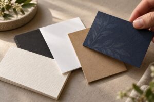
The stock you choose changes the card before anyone reads a word. A smooth, bright stock can give colorful artwork a crisp look. An uncoated stock has a more natural feel and works well if you want room to write a note. A thicker stock can give even a simple design more presence.
Color and texture matter, too. A distinctive paper can make a minimal logo feel intentional, while a classic stock may let detailed artwork take center stage.
There isn’t one “best” business card paper. Think about the impression you want to make and how the cards will be used. Seeing and feeling samples is often the easiest way to decide.
Use a Finish to Change the Feel
Finishing adds another layer of personality. Depending on the design and production method, options may include a matte or gloss treatment, rounded corners, or a coating that highlights selected areas.
For example, you could keep most of the card understated and draw attention to the logo. Or you could choose a finish that makes a bold, full-color design feel especially polished.
The key is to give the finish a purpose. One well-placed detail can have more impact than using every effect at once.
What Is Five-Color Business Card Printing?
Most full-color printing begins with four process colors: cyan, magenta, yellow, and black (CMYK). Five-color printing adds another ink to the job.
Depending on the press and project, that fifth ink may be used for a specialty color, a spot color, white, or a clear effect. If your brand color needs special attention—or you have an idea that calls for something beyond standard full color—ask us what’s possible for your cards.
The right approach depends on your artwork, paper stock, quantity, and the look you want to achieve.
Add a Clear Detail
Clear can be a subtle way to make a business card memorable. Imagine a pattern that appears when the card catches the light, a clear accent over part of a logo, or a tone-on-tone detail that rewards a closer look.
“Clear” can mean different production methods, including transparent ink or a clear coating. Each creates a different result. Show us the effect you have in mind, and we can help determine what works with your design and stock.
Make Creative Business Cards Feel Like Your Brand
A memorable card doesn’t need every available effect. A textured stock with simple printing can be striking. So can a smooth card with one carefully placed clear detail.
Before choosing your options, ask yourself:
- Should the card feel bold, refined, playful, or understated?
- Is the design mostly type and a logo, or does it include photos?
- Will people need to write on the card?
- Which detail should they notice first?
Your answers will help guide the paper, ink, and finishing choices.
Bring Us Your Idea
Have a business card idea that feels a little outside the ordinary? We’d love to talk through it. At Pioneer Press, we can help you explore stocks, finishes, and color options that fit your design and budget.
Talk with us about printing creative business cards, and let’s make a card people will want to keep.